UIST Branding Materials
Complete re-branding of promotional materials for the University of Information Science and Technology’s “St. Paul the Apostle” from Ohrid
Initial Problem
Re-branding the University promotional materials was a challenge for many reasons: it takes creating a whole new brand image for the University and establishing some more competitive visual presence of the University.
Our Solution
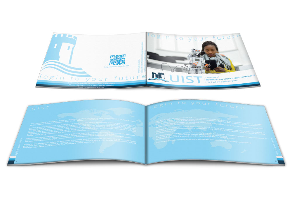
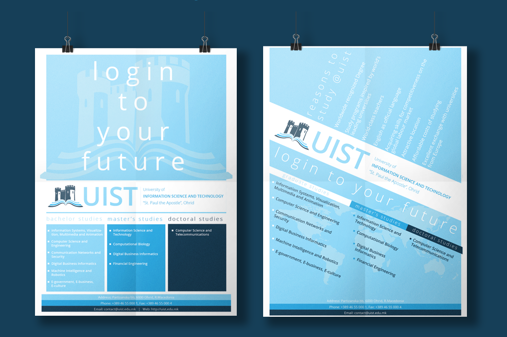
Using the main three colors of the University logo, three shades of blue, the decision was to go with minimalistic approach as much as possible, with emphasis on the strong sides of the University and competitive promotion.
Amazing Result
The University got an entire brand appearance specific to its characteristics and recognizable when exposed together with other universities. The branded materials were used in all public University exposures and education fair promotions.
A Variety of Items under the Same Visual Image
From a full-info brochure, to mini brochures, flyers, posters, business cards, invitations, certificates, etc., we are happy to see that we successfully crated an image about UIST that everyone can now recognize.